Thursday, 26 November 2015

Mog The Cat - Sainsbury's Christmas ad - Judith Kerr


Mog is a character created by Judith Kerr for her illustrated children's novels. She gets up to all sorts of mischiefs and always ends up creating a negative impact on her owners, but the problem is always resolved and always ends in a happy outcome for mog and her family. 

As an effective advertising technique, sainsbury's have taken this well loved tabby cat and brought her from the page to the screen in a Christmas advert, bringing her to life with 3D CG graphics. However they haven't made her look realistic, they have kept her illustrative style which I think is brilliant , this also keeps her easily distinguishable to children and makes the advert more magical as children find Christmas really special and relating mog to Christmas , as a result makes mog more special in their eyes. It is also a great money making scheme because of this effect , children are going to love any merchandise that comes out, we have seen evidence of this as mog the cat sold out instantly on her first sale day. 

The animators have also successfully brought to life all her traits that are depicted in the books and her personality through her emotions. 

Overall I think this is a great advertising strategy and therefore money making technique for sainsburys, involving mog in the spirit of Christmas and making her available physically in merchandise to children. 

As an animator is is most interesting watching the making of video:


Which details in depth the process the animators and production team went through to bring mog to life. From the software to screen. 

Wednesday, 25 November 2015

Shaun the Sheep

After being so inspired by Will Becher, seeing the behind the scenes footage, watching the puppets come to life in the film was great. My initial thoughts of the film were that if would be aimed at children and too dumbed down but, I was wrong. The humour was made for everyone to enjoy, children or adults. And the narrative was brilliant, yet again sculpted for everyone to enjoy, riddled with humour throughout it was a very enjoyable watch.

If I hadn't of watched Will Bechers masterclass, I would not of watched it in the same way. Becher's talk added a great aura to the animation. Seeing the props, knowing how they were hand-made by a local craftsmen, seeing the water, knowing how they made it look realistic and added a whole new light and really exposed how wonderful animation is. 

Will Becher Masterclass - Manchester Animation Festival

From script to screen.

A masterclass from the best in the stop-motion industry


It was a magical experience to see behind the screen of Shaun the Sheep, seeing content no one ose outside has had the pleasure of seeing. We also got a chance to see the models up close and personal, which was great to see.

He took us on the whole journey of the animation process in brilliant detail. From the animatic to the creation of sets, characters and props.


What I found really brilliant was seeing the animators act out scenes from the animatic for reference, seeing them laughing and having fun whilst in the workplace was really great to see, when watching an animation you are caught up in the magic so much that you forget that real people work so hard to make it.

Bob Godfrey - Celebrating 40 years - Manchester Animation Festival

It was wonderful to see the academy award winning 'Great' an animation directed by Bob Godfrey up on the big cinema screen. It was both experimental and alternative, telling the life of IKB in a crude and humourus manner. Bob loves musicals and you can see this reflect in 'great' with the story bring told in  song. There were no character sheets or model sheets, Brunel slightly changes through scenes because of the different animation directors, really adding to this crudeness. It is debated it could have been the first example of British computer animation in an Award winning film, with the blueprint mechanical drawings of the ship, made with computers to get the perspective without it being so labour intensive doing it by hand.

After the film it was great to listen to the talkers Tom Lowe (Bob bodfrey collection) Rebekah Taylor (special collections officer) and Jez Steward (BFI curator) who gave a background to his life, celebrating his life and personality hat still remains through his animations. 

We got to watch a snippet of "40 great years: the making of Bob godfreys 'great'", which is still in its crowdfunding stage. 

I feel the talk could of been much more Bob Godrey orientated and personal, it seemed to revolve around the speakers more than celebrating Bob. Perhaps it would of been better to have a relation of Bob Godfrey in to talk. 

Friday, 20 November 2015

Manchester Animation Festival Reflection!!


I have loved MAF, I feel it has been such a beneficial experience for me. From the Masterclasses I have learnt so much more about the industry as a whole and the qualities needed within it. I have learnt so much about the practitioners themselves and have been fascinated with their stories and own individual approaches to their practise of animation. 

From watching all the shorts and graduation films I have been so inspired. There are now so many techniques I would love to try and aesthetics I would love to approach and play with, all the possibilities that there are within animation.

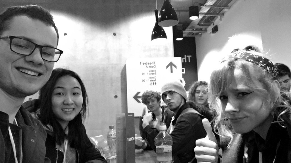
Not only has it been so educational, but It has also been a great trip to get to know my own animation crew better, which is always important.


And best of all, Tim Searle gave me a signed Mr Bean Teddy. 

It can't get much better!


Short films 2 - Manchester Animation Festival

Analysis of shorts I enjoyed and why:

Teeth - Daniel grey and tom brown
Nice sketchy style dark pencil style. lighting dark and stale along with atmosphere. The sound effects are very effective and realistic, they grate on you, you feel it physically happening and relate it to your teeth. Connotations of death and rotting with the fly motif and white flesh. Obsession with teeth. 

In deep waters - Sarah van den boom
'Underwater tears don't show' really interesting narrative. The animation using props and realistic photographs and objects combined with digital handdrawn 2D animation. There was a really effective scene where a past story was retold using the reflection in tea mug. Oil paint animation was also used in greyscale. Twins that die in womb. Looking fir the one that disappeared.  

The story of Percival pilts
A narrative about a boy that decides to live his whole life on stilts. 'never again should our feet touch the ground again !!' The animation started off with a  birds eye shot composition to reflect this.   Narrated by mark Harlow. All composed effectively with stop motion with some CG components. Nice narrative, enjoyable for children. 

STROMAE: ‘CARMEN' 

Handdrawn style. Music video showing relationship with Twitter dictating our social lives in a negative manner, eventually leaving you in the dirt.


The orchestra
Musical personalities. Making soundtrack to life in retirement home. Represent the noise in their heads ?? It presents ideas of love, as finding your soulmate is finding someone who follows your tune and make an orchestra together 

AMÉLIA & DUARTE

Pixilation library of love lost lovers department. Interesting narrative idea.

The sleepwalker. 
Abstract dream like state. Very sensual with music and animation that is in sync to it perfectly. 

The Master - Short Analysis - Manchester Animation Festival


I was gripped.

A seemingly average narrative about a dog waiting for his master, dramatically changes into quite a captivating thriller where you are captured wondering what the fate of these two characters is...
A chimpanzee is introduced from a cage and the dominates over the dog and becomes the "master" and starts wrecking the house. You feel intense sympathy for the dog, this is cleverly done through cute character creation and its stop-motion movements.

The dog ends up being beaten by the chimpanzee, and abused. At one point they share a bed, this presented me of the underlying message of relationship abuse. Then unexpectedly the chimpanzee ends up getting hurt and are made to feel sympathy for him, even though he has abused the innocent dog that we have been made to feel for, this is a great technique. There is repetition of the light through the window showing the need for the human authority, and the possibility of imminent death, how death seems like the most viable option without a human master. Which is the case as the short ends in a tragic way with both of them being killed. I loved how it never even needed to show the chimp being killed, the blood splatter on the chair was enough to demonstrate. 

The Meek - Short Analysis - Skwigly Showcase


"The meek shall inherit the earth..."

I loved the meaningful narrative behind this seemingly lighthearted animation (on the surface....) and the many depictions that can com
e from it..

The narrative starts off like a love story, however this is instantly made a contrast when what is thought to be a romantic light turns out to be a cigarette.

The beings end up craving the warmth from the cigarette. So much so that a whole class system builds. One character sits on top directing the slaves down below to keep chopping at the ash to make more warmth. This whole stance seems to have strong relations to and could therefore symbolise our society. How we are governed by this body, to keep wasting away the earths resources. They are over-worked to the extent that they get ill. The characters' lungs go black and fall out, reflective of the illnesses directly associated with smoking itself. This narrative could also symbolise the cigarette industries who sit there, raking in the money whilst people smoke their cigarettes and die as a direct result. The cigarette could be a direct motif of the earth, the characters are the humans, drawing and wrecking its life force. Then when this is finally all depleted, we find a new alternative, like the characters do with this cotton-like substance. This therefore could reflect our coal-burning history, how we burnt coal to create energy, then how this is running out we found a new source of energy in the form of electricity.

The title also further reinforces my interpretations as the dictionary definition of "Meek" is: "A term referring to the kind and fair." This title is such a direct contrast to the animation that it has to be intentional, meaning it connotes of destruction and unjust exploitation.

The Re-Making of Dangermouse - Manchester Animation Festival

 This presentation was brilliant. I have never really had a chance to watch Dangermouse, as a child I was too young to ever get to watch it, but this talk was so informative of the whole pitching process that us animators will all at some point have to go through. The whole process of responding to the set brief of the re-creation of Dangermouse was described in-depth and it was really fascinating to see how they took something so classic iconic and moulded it into the modern era.

Robert Cullen (director) Ben Ward (Head writer) Sarah Muller (Exec Producer) were all interviewed. They stressed how they didn't want Dangermouse to be a kids show, they wanted it to be a comedy show, for a range of audiences (mainly children) but enjoyable to everyone by an extent. You can see that this element heavily influnced the character design...


The classic DM has a more rounded shape, more "playful" and "friendly", where as the new DM is more "striking" with corners and defined lines and a frown of determination, not so much childish, he seems more mature a character in aesthetic. He also has a more defined facial structure, his nose now has a distinctive shape, this acts like a logo, this was done purposefully so he can be distinguished just by certain features alone.

The animation of the characters also was advanced, with 3D movements incorporated which ground him and add believability.

The narratives have what is called a "two-line pitch" where an enemy has a motive (spider wants to eat world) this then has a personal effect on DM (he is scared of spiders) which is an effective narrative technique.

With the animation process, the animators and production team wanted to keep the class background idea of involving photographic elements into his environment. Also the iconic characters HAD to be kept, not forgetting how action-packed the episodes were.

With background there were a lot of things to consider. They wanted to include textures and drawn in elements, a blurred line between real and painted. This obviously came with issues, the task of integrating 2D and 3D, tricky to blend perspectives, without it looking like a collage.

Here were some special examples that I photographed of some great concept art for background:


You can see the mix of dramatic compositions, where it is evident the desire to make Dangermouse more cinematic. James Bond like.

What I particularly loved was how they stressed their enjoyment for the project. How they loved coming into work and creating it...  I think that is just great, and you can see the enjoyment within the animation itself.

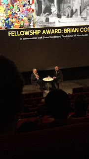
The fellowship award - Brian Cosgrove - Manchester Animation Festival


It was great finding out about the important part that Brian played in animation, as his animations were not of my era and generation. It was also great finding out about Brian as an individual through a special Q and A sessions and seeing him presented with the award was a very special experience. 
We were shown clips of his early work and it was very interesting to see how profoundly his work develops over time, with such legends you seem to forget that they also develop as an animator the same way yourself does. 


Finding out about the beginnings of dangermouse and how they developed BFG was interesting, especially the element where they had to dramatically change the aesthetic of BFG created by Quentin Blake's illustrations for Roal Dahl. It was really touching to find out how much roald Dahl appreciated the animation, Cosgrove stated that he stood up and applauded his animation. Imagine how touching that would of felt as an animator...

Grad films 2 - Manchester Film Festival

It was great to watch animations from graduates at the festival, to have an insight of the standard at graduate level, that one day I will be at. There was a great assortment of CG, , 3D, traditional and stop motion. The majority were lighthearted and humourus, not many touched on serious issues. 


Notes on some of the films I liked and why they were so special:

Edmond
This short was very much empowered by dark humour. Using stop motion techniques, a generally lighthearted and innocent animation technique to contrastingly expose his cannibalistic tendencies after consuming his twin in the womb. 

I loved the technique, using stop motion puppets with hand-drawn components on top looked very aesthetic. 


Within

Beautifully digitally drawn, highlights the insecurities of beauty within girls, a sensitive issue, beautifully tackled with motifs on the face that we usually associate with beauty, such as flowers. The hand-drawn element adds a feel of fragility, like the sensitivity of girls within when it comes to their beauty.

Meanwhile 
I liked the aesthetic of meanwhile, they sell had exaggerated eyes and fitted together well in the same universe. The animations follows 4 people as they walk through the streets, following their minds and everything inside of them. I thought this was quite poignant because I wonder a lot when I commute what others are thinking. I loved the separation of the characters with the 4 colours CMYK, the colours also had a connection to their personalities and current emotions. Until they meet when suddenly they all come across the same accident, their worlds are brought into full colour, reality hits. 

Wolf games
Had a great use of sinister sound effects, tied with scary cut scenes, created quite a dark and austere tone to the animation, complementing the style and narrative which revolved around the hungry savages.

#286
A stop motion animation with a great narrative. A crazy scientist monster maker creates an unscary monster much to his distaste, however after the monster saves one if his test tubes, he has a certain fondness towards him, until the monster fuss appears after drinking the substance he just saved. 

Bampa
Beautifully deep animation about dementia. The animation fitted to a touching personal narration, riddled with symbolism and motifs about dementia, jigsaw representing how his brain isn't working together and the puzzling challenge of now recognising his own family, how his family tree disappears also reflects this, the dribbling ink also reflecting how it's as if his brain is bleeding, suffering from injury from the attack of dementia. A lack if colour is used to pronounce the lack of memory. The style of illustration is very childish in nature, reflecting how his childhood memories are now about to fade?

Banaroo chrustmas Island 
Magical feel, beautiful narrative. Love how the hand-drawn digital style has the aesthetic of a crayon pencil on paper. 

Is it just me ?
Loved the abstract style of this animation, so abstract it's like a journey for your eyes to figure out stars going on, which I loved. It had a very geometric, printed style, minimalist scheme. 


MANOMAN - Graduation Film - Manchester Animation Festival


MANOMAN is an animation using slightly unnerving puppets, to take you on a truly imaginative and insane and primal narrative journey.

Starting its narrative with a character who goes to primal therapy, after finally releasing his anger, his anger turns into a physical entity in the form of a confident, mischievous alter ego that shows him the bad ways he obviously is so not used to. This drives him insane and drives him to suicide. All together this animation is very primal and controversial with profound dark humour within it. The 3rd wall is also broken as his alter ego attacks someone by using the puppet strings to control him to attack himself.

A well deserved winner of the Manchester Film Festival Audience. (One I personally voted for myself..)

Graduation films 1 - Manchester Animation Festival

My big brother
I loved the cubic style it was very unique, using characters with a cardboard aesthetic and minecraft style pixelated backgrounds.

Connected
Loved the style of this 3D animation, the characters have oil painted features, with very pale unhealthy looking skin, reflective of the unhappy state the characters obviously live in as they are controlled by a greater being. 

The moustache 
Thoroughly entertaining. A great example of how shot composition, actions and sound effects can really elevate humour. 

I'm good with plants 
I loved the meaning within this one. It stresses the importance of becoming more Eco-friendly and respectful to the environment. In once scene the stars fall and plants are grown from them, connoting of how plants are a gift from God and should be respected. At one point in the narrative the protagonist steals a plant, when he is preoccupied in stealing, a water pipe bursts and ends up flooding everything, symbolic of global warming and water levels rising for our neglect towards nature. 

Sea child - Graduation Film - Manchester Animation Festival


Utterly beautiful. This animation was unique in its style, created from what looks like the media of charcoal and inks it captures you in this unfluid, imperfect state of beauty. If the animation was fluid, then it would not of been as effective, I loved how jittery it was it adds value to the narrative itself, which pronounces the imperfect patriarchal society that we live in. There are heavy connotations of blood, reflective of the protagonist young girl coming of age, finally becoming a women. But what does it mean to be a woman in a patriarchal society ? As she discovers her mother exploiting her body to men in a night club, and receives countless perverted comments from older males herself.


Grad films in competition - My favourite "Tusk" - Manchester Animation Festival


My favourite from this graduation selection was the short, Tusk. I found it truly enthral long both visually and in narrative. It possesses a hand-drawn feel on digital, however this us combined with 3D elements, which gives together to make a very beautiful animation. The character design and aesthetic is gorgeous. The narrative revolves around a mammoth that awakes into a new era where evolution has carried on without her and she ends up being neglected and bullied by the elephant species. They call her names and discriminate her existence because she is different, therefore touching on the very sensitive issue of bullying towards others in a lighthearted manner using mammoths and elephants. What I loved the most was the shot at the end of all the ither mammoths frozen under the ice beginning to crack and possibly awaken, showing this whole cycle pus going to repeat and repeat. The sound effect of a didgeridoo s used to show the mammoths primal and animalistic aspect and she is shown walking in the snow to pronounce her desolation from being different, their seems to be an underlying core to this animation saying that people should not be mistreated for who they are and for being different, individuality should always be respected.

Tomm Moore Masterclass - Manchester Animation Festival

The making of song of the sea.

Tomm Moore's masterclass was a delight to watch, it was fascinating finding out about the development of song of the sea, such a beautiful animation, and an insight into the industry from his point of view.

Tomm Moore is part of Cartoon Saloon, where Secret of Kells was his first feature film. The film had a strong Gaelic influence, as Moore loves to personalise his films with a piece of him, and the Gaelic is reflective of his childhood in Ireland. Whilst producing this film, it was interesting to find out how Moore came up with the idea for Song of the Sea, this really shows that when in this industry, it never stops. Your always thinking about new potential ideas and opportunities for the next project...

In the production of Songs of the Sea, Moore stressed how collaboration was key. Each partner was responsible for a portion of the work.

With Songs of the Sea, Moore wanted something melancholy like My Neighbour Totoro and strongly based on his memories of childhood in Ireland. Jungle book was a very special animation to him and fuelled his desire to make one like it..

With Songs of the Sea, Tomm wanted to keep an organic hands-on feel to the animation, so he started with watercolour concept art. They created 100 Scene illustrations and mock ups of final scenes to make a final piece of art that was as close to what they wanted on screen as possible.

They even went on research trips to engage with the environment they wanted to capture and so they know each other's point of view and get a feel of atmosphere. They went on sketching trips in the Irish landscape, using landmark references. This made the crew feel together even though dotted round Europe. It was great to see the concept art evolve as a result from trips. What was really interesting to hear was when Moore commented on how as a result of the European partners seeing the irish landscape for the first time, their visual interpretations were profoundly more beautiful as they viewed it with fresh eyes and their drawings really exploited the beauty more-so. 

To reinforce the fact Moore loves personal connections with his animations, he stated how "Ben" was based on own son, he even used photo references. It was great to see the evolution of characters. Everyone who dew the characters brought something else to it, therefore they kept on updating becoming richer, a joint effort. The spirit of collaboration made film richer  hope to feel ownership

Selfie stories metaphors for loss and death. Deal with that in a gentle way for song of the sea. Story given a resonance with the folklore and find out parts most relevant to the story. 

Also something that I never thought about was the relevance of the actors in the animation, which brought a lot to their characters he stated, an extra life.

Tomm highlighted how music was so intrinsic to the animation.  He wanted a keltic aura, that sung the spirit of the film. 

Soft atmospheric look soft pencil even though hard line drawings. Attitude to environment. 

How to blend old beliefs with modern world. Mochas house a mix. Electric in treehouse. 

Interested in how animation has language of its own. Created more of dreamlike atmosphere shape motifs. Hand drawn can draw on a visual language that's similar to 2D drawings long back fi cave drawings. Scene illustrations pan that. Builds up richness to sequences. 

The settings were beautiful and well thought about. There are no lines around countryside drawings, to create softer aura. As a contrast to geometric buildings. Changing the technique gives a certain atmospheric effect subconsciously. Scene illustrations useful aswell to help figure out how to compose shots.

Somgoftheseamovie.blogspot

@Tommmoore @cartoonsaloon @paulyoung99

Thursday, 12 November 2015

Pharrel Williams "It Girl" - Attack on anime industry


Mostly animated , Pharrell Wiliams' music video to 'it girl' indirectly seems to attack the Japanese anime culture. The video presents young anime girls in a sexualised manner , in bikinis and swim suits. Reflective of "lolita' a Japanese porn genre revolving around young girls involving in sexual acts. Pharrell Williams observes the girls with binoculars, unearthing a really creepy sense to the music video, he later then begins texting the girl saying 'she looks sweet' choosing clothes for her , controlling her in essence. Here pharrell could be depicting himself to be the males who ship and read the illustrated peadophillic porn comics and how they control the industry. 

 In the video the girls are buried in sand whilst their fellow girlfriends sculpt bodies for them out of the sand. One girl sculpts a pregnant belly on the girl, this is ironic given their obvious infertility at their young age. Thus therefore could be symbolic young girls (animated or not) should never be thought of as sexual or treated in a sexual way. 

Whether Pharrell intends this message remains unclear, but when looking back at his music history we see the controversial video 'blurred lines' which received countless attacks from feminists as the video basically condones beating and controlling women for sexual pleasure, almost objectifying them as something to be used for pleasure of men, as they stroll around naked on the music video, remaining vulnerable to the fully clothed men.

If he does intend this message then I fully agree with it and respect his efforts, as even though in comic format it remains relatively harmless, it's what it does to your mental state. If you are sexually attracted to young girl illustrations then this is going to effect you in real life and could encourage peadophillia. 

Doing more research into this dark industry I found this BBC news post highlighting the issue and its consequences, which enlightened me a lot on the subject and was most disgusted to indulge in. 

http://www.bbc.co.uk/news/magazine-30698640

The article highlights a sinister fact;

"In June 2014, Japan's parliament voted to ban the possession of real images of child sexual abuse. Production and distribution of these images had been illegal since 1999, but Japan was the last country in the OECD to outlaw possession."

Only last year was the distribution of real child sexual abuse images banned. This really highlights this obsession that is rife, and possibly intensified with these comics.

The attack aside, the music video includes some impressive rotoscoping of Pharrell, the frames have been individually painted over with watercolours. Though I am not sure this aesthetic fits with the computerised anime in the background.


Wednesday, 11 November 2015

After Effects Induction 1


This induction was great for me, I got my head around the basics of key-framing and produced a short exemplar of this, using some scale manipulation key framing and positions. This could be very beneficial for my animation as After Effects offers more key-framing capabilities than Photoshop. I can't wait to get into the more complicated realms of the software, I enjoyed using it and I am excited to see what more it can offer.